
RRD Campus is a digital education platform for medical professionals specialising in rare diseases. As the sole designer, I created the information architecture, navigation, flows, gated content system, and high-fidelity UI for a scalable knowledge hub.
RRD’s content was fragmented across PDFs, emails, and outdated pages. Doctors struggled to find disease-specific information, and sales teams had no way to track qualified leads. The challenge was to centralise content, create a consistent navigation model, and implement registration-based gated access for lead generation.
RRD’s content was fragmented across PDFs, emails, and outdated pages. Doctors struggled to find disease-specific information, and sales teams had no way to track qualified leads. The challenge was to centralise content, create a consistent navigation model, and implement registration-based gated access for lead generation.
Doctors need fast, targeted access to disease-specific information.
Trust and clarity matter more than visual flair.
Sales teams needed visibility into which clinicians engaged with which content.
Editors needed a scalable, reusable component structure.


Prioritise clarity over decoration.
Use progressive disclosure for dense medical content.
Design a navigable system rather than isolated pages.
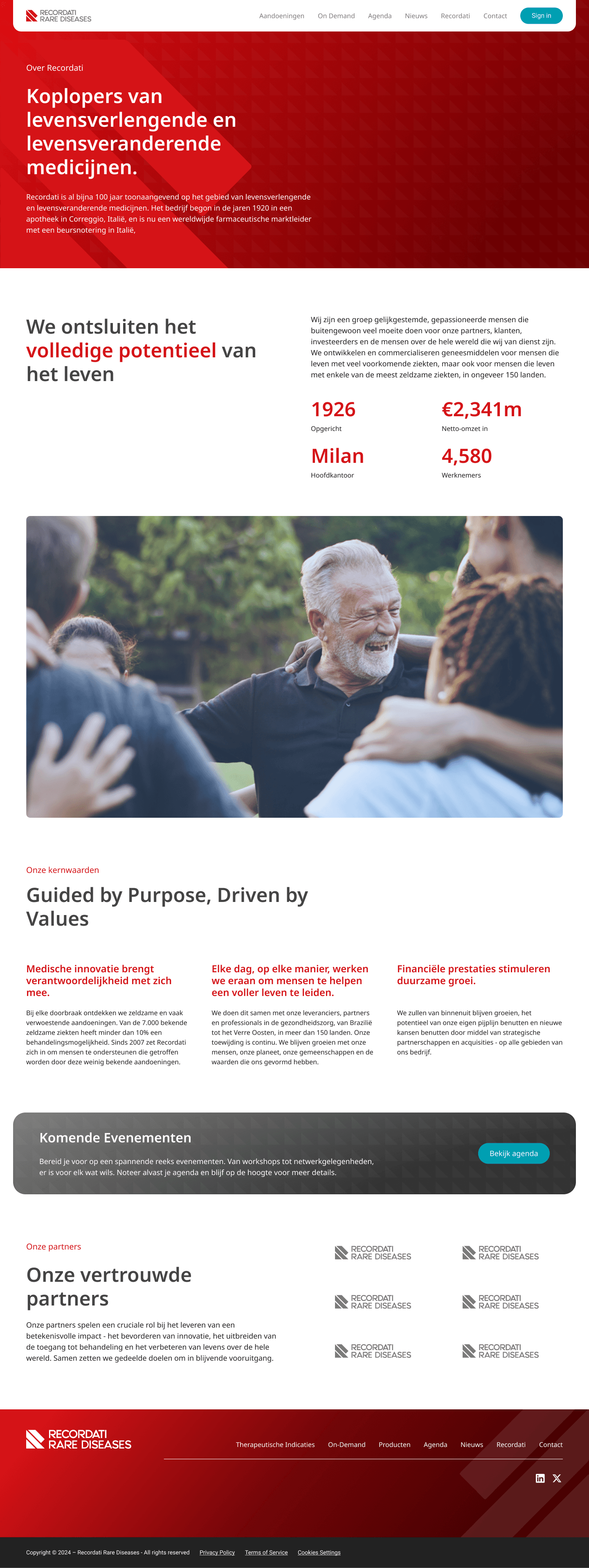
Surface trust and credibility early.
Create an IA that can support additional diseases and content types.
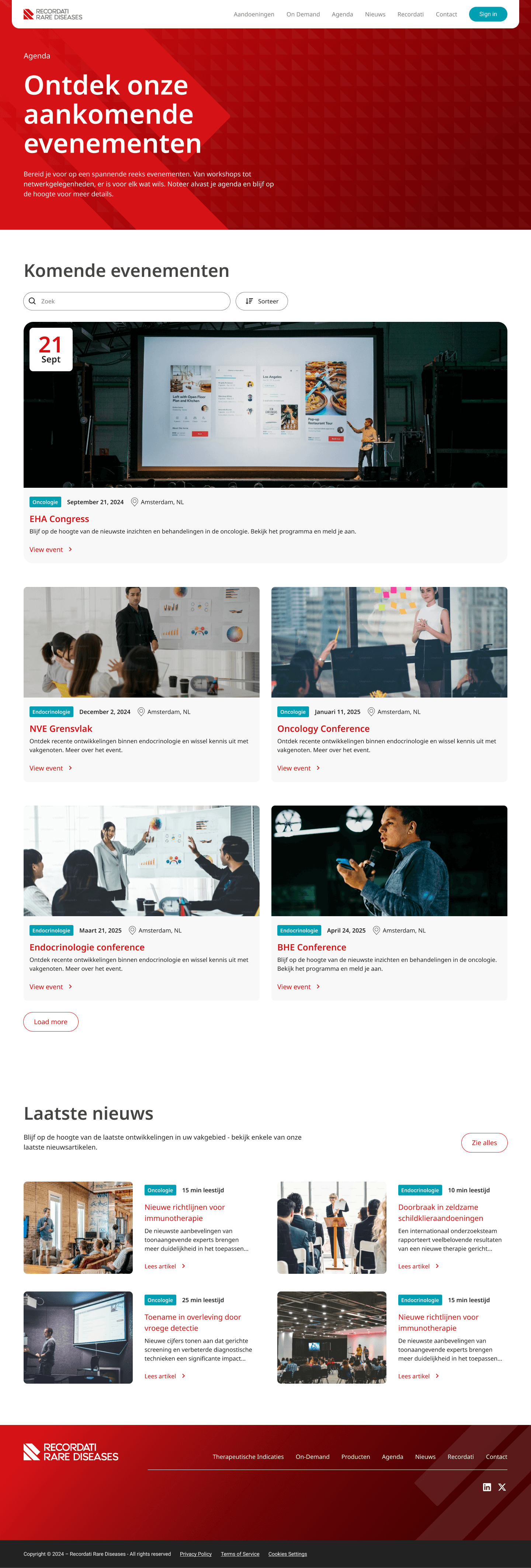
Core flows included anonymous browsing to disease hubs, entry into gated content, registration, and then personalised access to videos, events, and resources. Diseases were structured into consistent templates: overview, symptoms, diagnosis, treatment, media, and events.

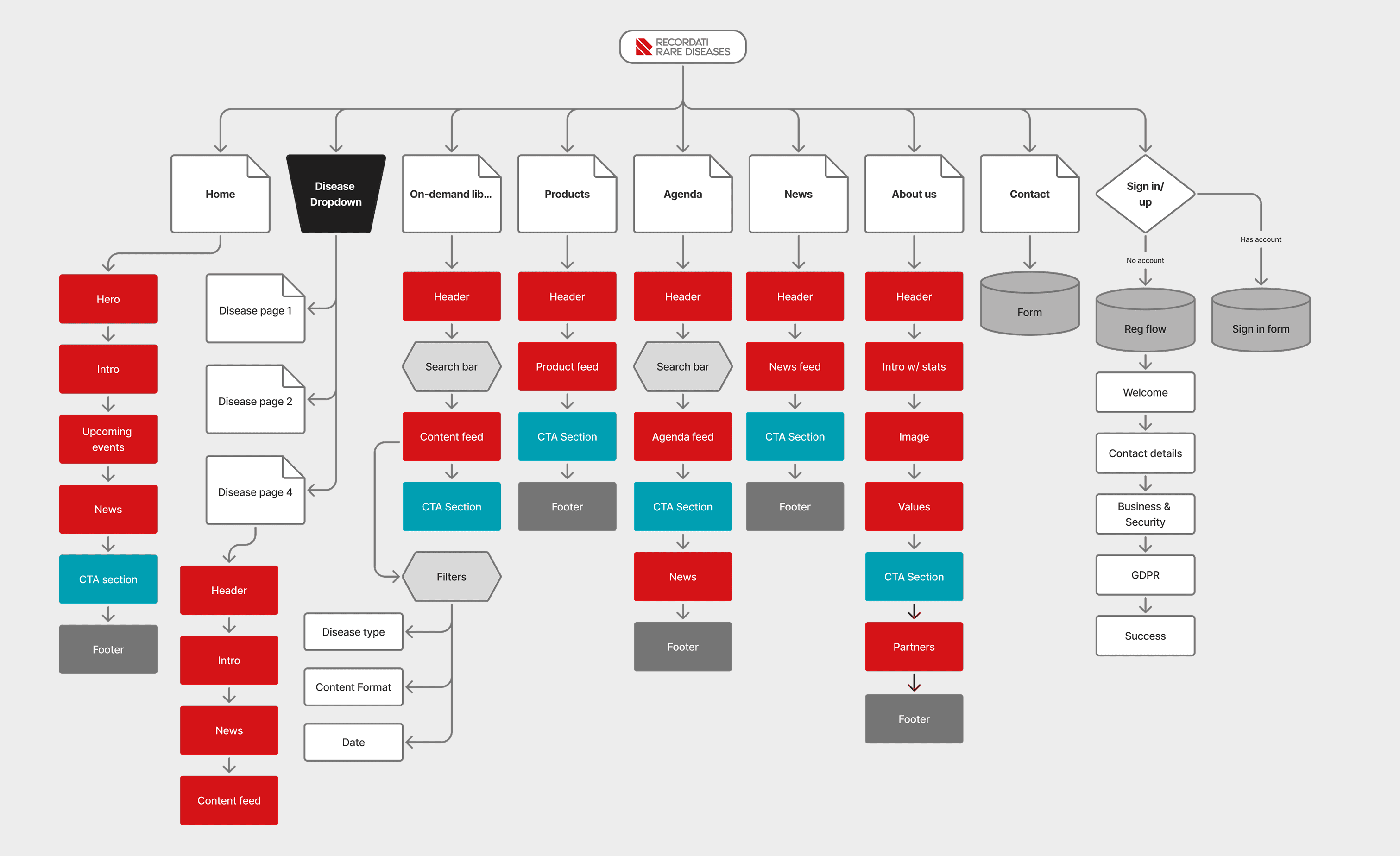
High-fidelity screens emphasised structure and clarity with disease page templates, event cards, video modules, content grids, and a clean navigation pattern. Registration modals and gated content states were designed to feel professional and compliant.
A central, intuitive hub for clinicians.
A clear lead-generation flow integrated with CRM.
Better alignment between medical, marketing, and commercial teams.
A modular content system that internal editors could maintain.
Increase in qualified HCP leads sent to the sales team
Faster navigation to relevant content
Decrease in scroll depth required to find key information


Compliance slowed iteration.
Different teams had conflicting priorities.
Scope grew as stakeholders saw the potential of the platform.
Early content complexity required iterative refactoring of IA and layout hierarchy.
I learned to design for high-stakes professional audiences, balance compliance with UX, structure dense information, and align multiple stakeholders around a single, scalable content architecture.

Hectool
Designed the core UX and high-fidelity UI for a B2B industrial tooling marketplace, simplifying complex product variants and building trust in a traditionally manual industry.

Jasmyn Cheng
Designed and built a boutique website for an Amsterdam-based artist. The project included building a CMS product library with a simple Stripe checkout.

Hoopooh
Designed a second-hand marketplace feature inside a childcare communication app, enabling parents to buy and sell children’s items without leaving the ecosystem.

Humble Lights
Redesigned the Humble Lights webshop to emphasise trust, clarity, and storytelling while preserving a luxurious brand feel.